Color Drenching: How to Create Cocoon-Like Luxury Rooms
SEO Title & Meta Description Included • Premium Design Insights
| SEO Specifications: |
| SEO Title: The Art of Color Drenching: How to Use Monochromatic Paint to Create Luxurious, Cocoon-Like Interiors Meta Description: Master color drenching: the interior design technique that eliminates harsh white trim for immersive, sophisticated rooms. Discover professional tips, finishes, and palettes. |
Introduction
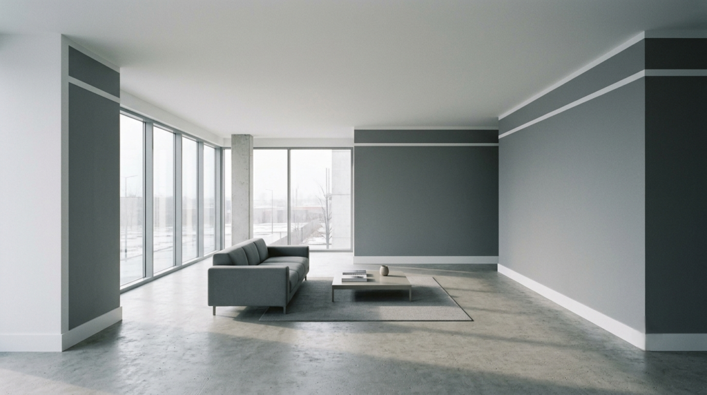
For years, the default setting of modern interior design was safety. We coated our walls in sterile greys, balanced every bold choice with a crisp white ceiling, and relied on contrasting trim to create a traditional, predictable structure. While this clean aesthetic felt fresh a decade ago, it has left many contemporary homes feeling cold, fragmented, and emotionally flat. The architectural lines of a room became a series of abrupt visual interruptions—white baseboards cutting off a beautiful wall color, and a stark white ceiling shrinking the perceived height of a room.
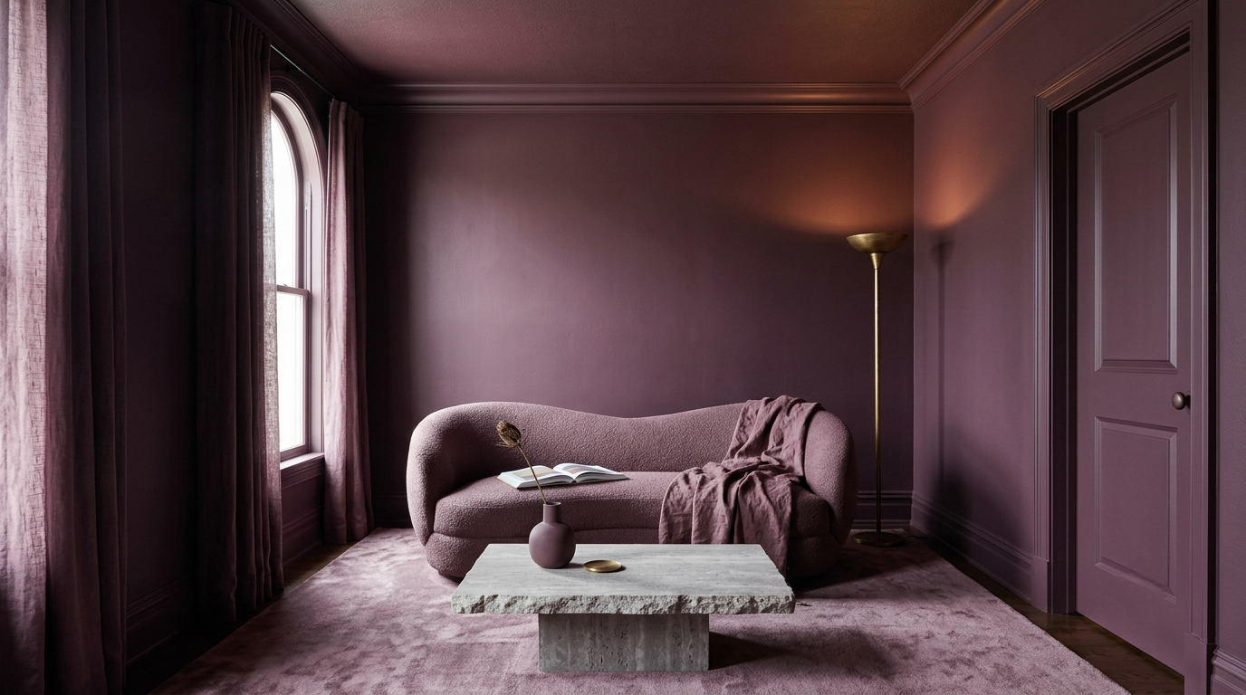
Color drenching solves this exact problem. It is the practice of taking a single, saturated hue and wrapping it across every surface of a room: the walls, baseboards, window casings, doors, picture rails, and the ceiling itself. This creates a seamless visual envelope that expands space and deepens emotional engagement.
This article is designed for homeowners, design enthusiasts, and renovators across the US, Canada, the UK, Germany, and France who want to transition away from clinical minimalism toward spaces that offer a sense of shelter, permanence, and luxury. In an era where our homes serve as sanctuaries from an increasingly chaotic outside world, color drenching provides an architectural solution that grounds us, enhances low-light spaces, and turns ordinary rooms into deeply personal, dramatic statements.
Core Design Principles
To successfully execute color drenching, you must understand how human psychology and interior architecture interact with monochromatic surfaces. It is not simply about buying twenty gallons of the same paint; it is about manipulating light, texture, and boundary perception.
The Illusion of Infinity
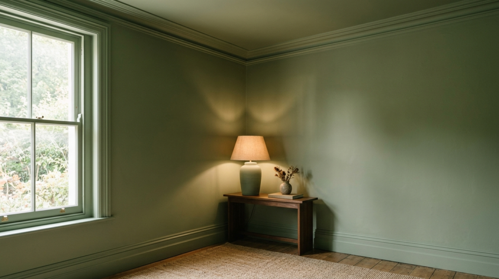
When you paint a room’s trim and ceiling a contrasting color (usually bright white), your eyes instantly map the boundaries of the space. You see exactly where the wall ends and where the ceiling begins. Color drenching blurs these architectural transition lines. By painting the walls, crown molding, and ceiling in the identical shade, the eye can no longer find a sharp contrast point to measure the room’s limits. This creates an expansive, infinite quality, often making small or low-ceilinged rooms feel significantly larger and loftier than they actually are.
Light Absorption vs. Light Reflection
Traditional design dictates that dark or highly saturated colors make a room feel like a cave. This only happens when the dark color is contrasted against bright white elements, which creates harsh, jarring lines of demarcation. When a room is fully drenched, the color absorbs light uniformly. Instead of creating shadows in the corners, the single hue softens the edges of the room, utilizing the natural shadows of the architecture to create a shifting, dynamic graduation of tone throughout the day.
The Importance of Sheen Versatility
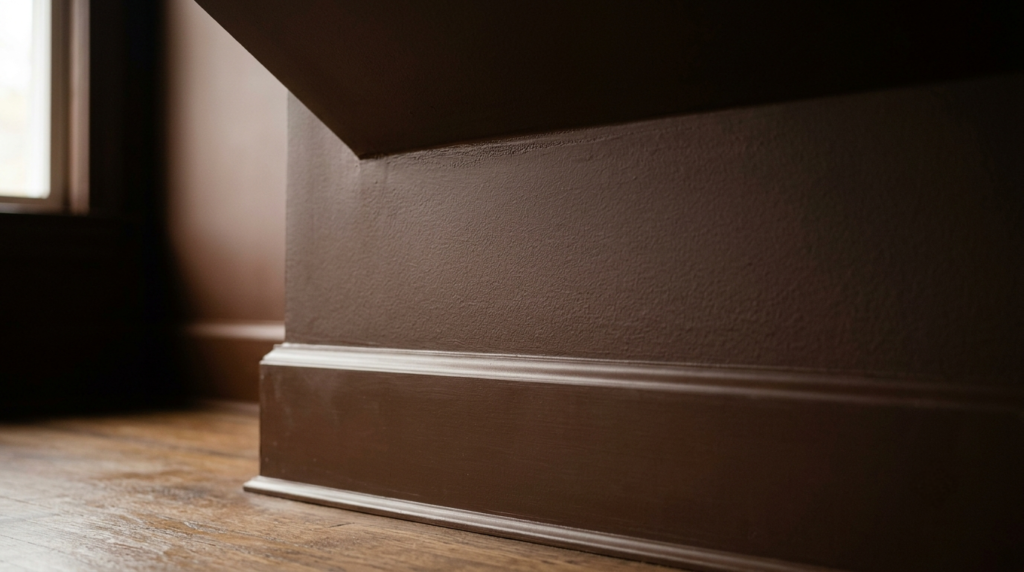
The secret to preventing a monochromatic room from looking flat or oppressive lies entirely in your selection of paint sheens. You use the exact same color recipe, but you vary the gloss levels across different surfaces.
| Surface | Recommended Paint Finish | Purpose |
| Ceilings | Ultra-Flat / Dead Matte | Absorbs light, hides imperfections, minimizes glare from fixtures. |
| Walls | Matte / Chalky Emulsion / Eggshell | Provides rich depth of color while remaining wipeable and smooth. |
| Trim, Doors, Moldings | Satin, Semi-Gloss, or High-Gloss | Reflects light along architectural lines, adding structural definition. |
8 Practical Ideas for Color Drenching
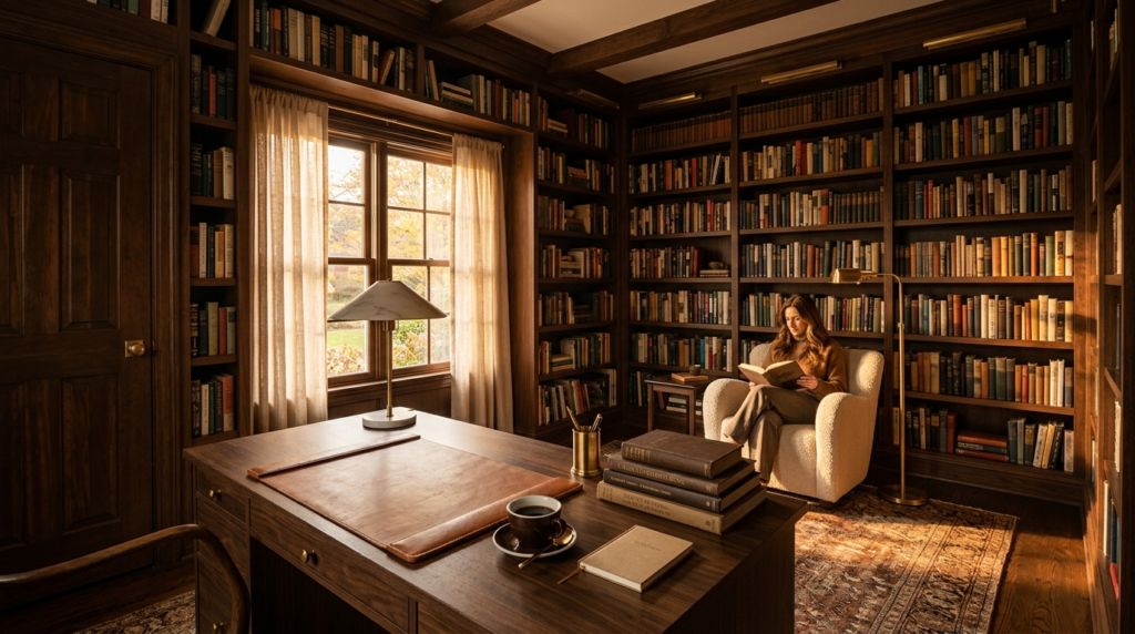
1. The Chocolate Brown Library & Home Office
What it is: Wrapping an entire home office or study in a deep, luxurious chocolate brown, inclusive of built-in bookshelves, window frames, and the ceiling.
Why it works: Rich brown acts as a grounding neutral that reduces visual static. It absorbs the harsh glare from computer screens, lowers cognitive fatigue, and instantly evokes the timeless, intellectual feel of a classic European library.
Best colors: Farrow & Ball – Tanner’s Brown, Benjamin Moore – Silhouette (AF-655), Sherwin-Williams – Turkish Coffee (SW 6076).
Common mistakes: Using a cold, grey-toned brown. If the undertone is too grey, the room will look muddy and depressing under artificial light. Opt for browns with warm red or golden undertones.
Budget-friendly alternative: Use a mid-tone warm taupe paint on the walls and ceiling, and transform existing laminate bookshelves by sanding, priming, and painting them in the exact same color using a durable satin finish.
2. The Terracotta Earth Powder Room
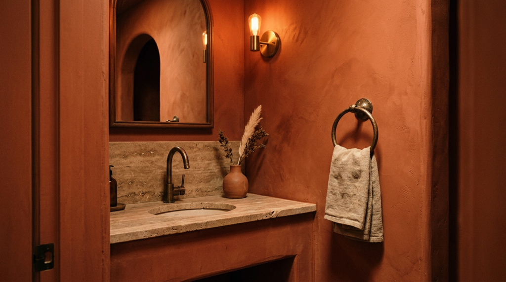
What it is: Drenching a small, windowless half-bath or powder room in a baked clay, terracotta, or rich sienna tone.
Why it works: Small powder rooms are the ultimate laboratory for color drenching. Instead of fighting the lack of natural light with bright white (which turns dingy and grey in dark spaces), embracing the small scale with a warm, earthy hue creates an unexpectedly welcoming, high-end guest experience.
Best materials: Travertine or tumbled limestone vanities, brushed copper or aged bronze plumbing fixtures, and linen hand towels.
Best colors: Little Greene – Tuscan, Benjamin Moore – Potters Clay (1221), Farrow & Ball – Red Earth.
Common mistakes: Pairing terracotta with cold chrome fixtures or modern white porcelain vanities without any wood or stone to bridge the transition.
Budget-friendly alternative: Paint the walls, ceiling, and door trim. Instead of replacing a white sink vanity, paint the vanity base in the same terracotta color using a moisture-resistant satin cabinetry paint.
3. The Deep Olive Green Sanctuary Bedroom
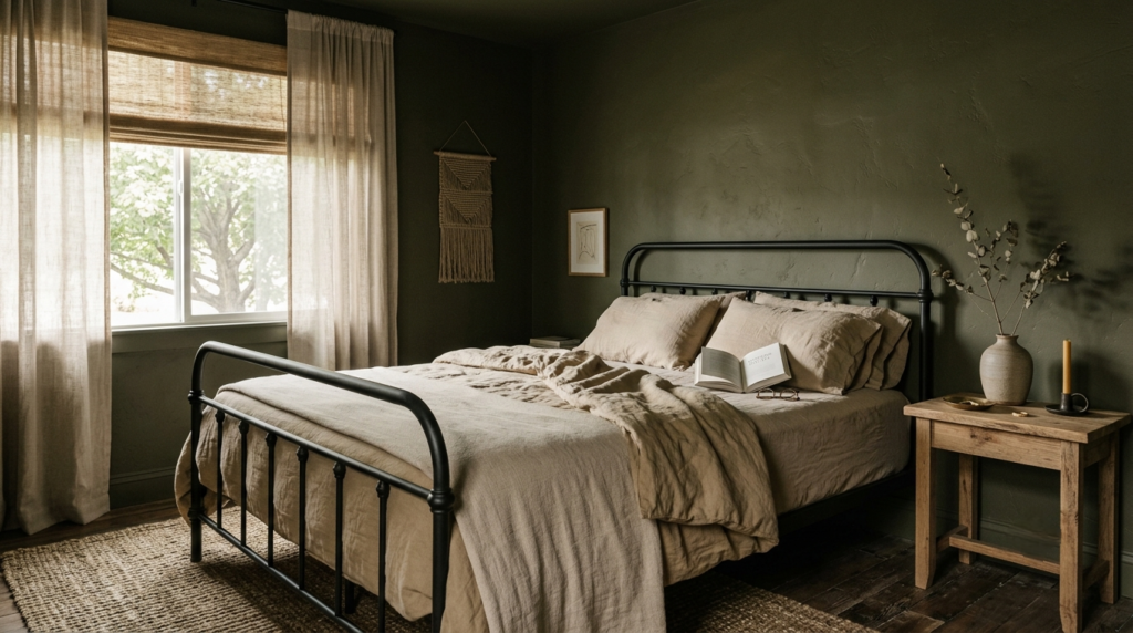
What it is: Enveloping the main bedroom in a muted, sophisticated olive or forest green with a velvety matte finish on the walls and a dead-flat finish on the ceiling.
Why it works: Green is biologically associated with rest, recovery, and safety. Drenching a bedroom in a muddy, olive-toned green lowers blood pressure and creates a seamless cocoon that signals the brain it is time to rest.
Best materials: Matte black iron bed frames, raw oak nightstands, washed linen bedding in flax tones, and woven jute rugs.
Best colors: Sherwin-Williams – Pewter Green (SW 6208), Farrow & Ball – Bancha, Little Greene – Puck.
Common mistakes: Choosing a green that is too clean, bright, or emerald-toned. Bright greens bounce light aggressively around the room, making it look like an athletic field rather than a sanctuary.Budget-friendly alternative: Focus exclusively on the bed wall, trim, and ceiling if the room is massive. Keep your existing bed, but dye your current white duvet cover using a forest green fabric dye to match the room’s depth.
4. The Burgundy Wine Dining Room
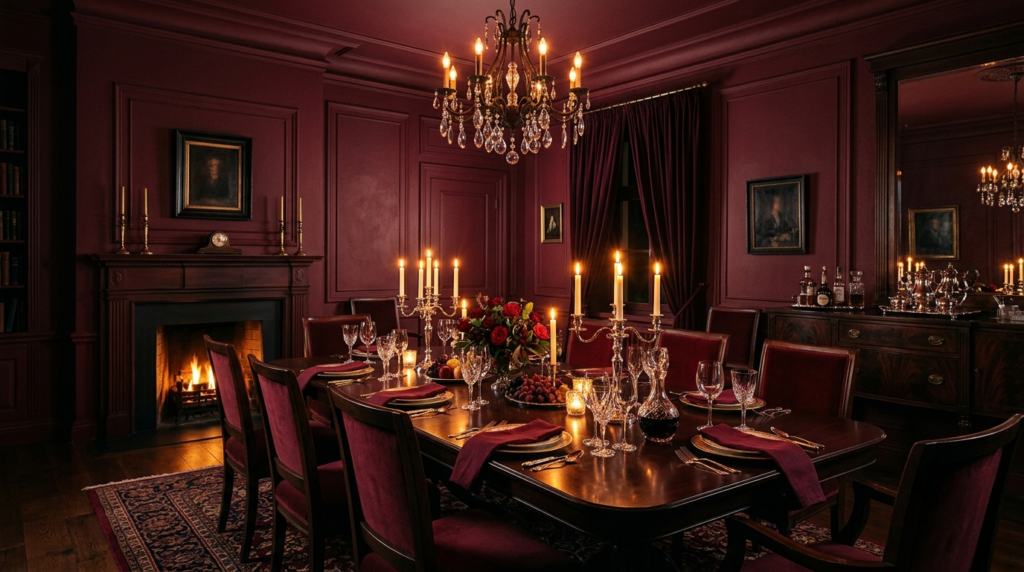
What it is: Transforming a formal dining room into an intimate evening space by drenching it in a deep, dramatic merlot, burgundy, or oxblood red.
Why it works: Saturated reds and deep plums stimulate appetite, spark conversation, and look spectacular under candlelight or low-wattage chandelier lighting. It creates a high-drama, restaurant-like atmosphere for entertaining.
Best materials: Polished dark mahogany or ebonized oak dining tables, velvet-upholstered dining chairs, crystal glassware, and polished silver accents.
Best colors: Benjamin Moore – Caliente (AF-290), Farrow & Ball – Preference Red, Sherwin-Williams – Burgundy (SW 6300).
Common mistakes: Using a cheap, plastic-looking high-gloss finish across all surfaces. Red must have a rich, chalky, or velvety texture on the walls to look sophisticated; keep gloss strictly reserved for the baseboards or a statement ceiling.
Budget-friendly alternative: Instead of buying expensive velvet chairs, purchase affordable slipcovers for your existing chairs in a tonal shade of berry or deep rose, and paint the entire room in the matching burgundy paint.
5. The Midnight Blue Media Lounge
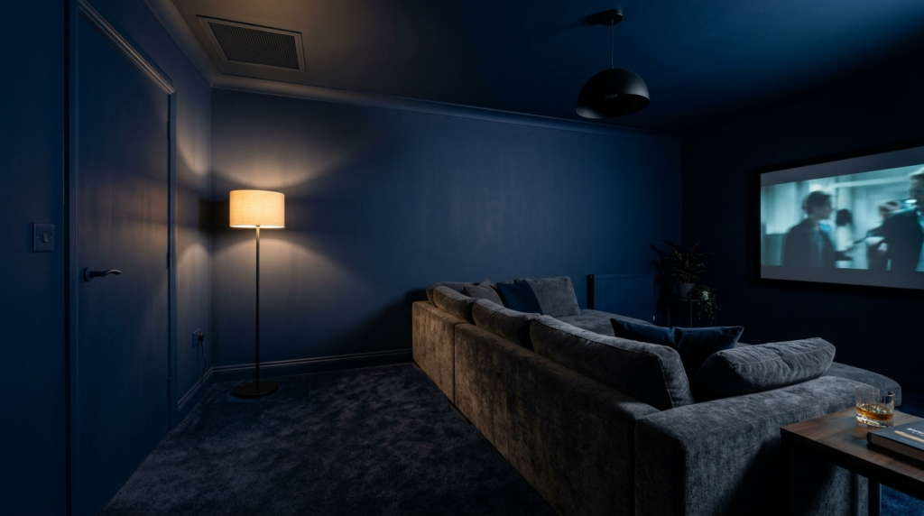
What it is: Drenching a dedicated television room, den, or cinema space in a dark, inky midnight navy blue.
Why it works: White ceilings and light walls bounce light from your television screen back into your eyes, creating glare and washed-out picture quality. A midnight blue drenched room completely absorbs light spill, drastically improving screen contrast and immersing you in the film.
Best materials: Oversized, deep-seated sectional sofas in charcoal or navy chenille, matte black light fixtures, and plush, dense wool carpets.
Best colors: Benjamin Moore – Hale Navy (HC-154), Farrow & Ball – Hague Blue, Sherwin-Williams – Naval (SW 6244).
Common mistakes: Forgetting to paint the radiator grilles, air vents, and electrical switch plates. A white plastic light switch on a midnight blue drenched wall breaks the illusion instantly.
Budget-friendly alternative: Use a high-quality spray paint matched to your wall color to spray all plastic switch covers, outlet plates, and vent covers yourself rather than buying expensive custom metal replacements.
6. The Warm Ochre Entryway
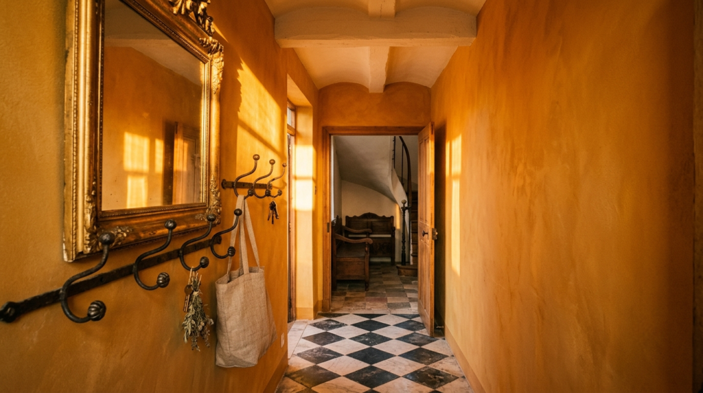
What it is: Coating an entry hall, vestibule, or corridor entirely in a sun-baked, mustard-tinged ochre or rich amber.
Why it works: Entryways are transition zones. Drenching this space in a vibrant, warm color creates an expansive burst of energy when entering the home, making the rooms that branch off it feel distinctly airy and bright by comparison.
Best materials: Reclaimed brick or checkerboard stone flooring, antique gilt-framed mirrors, and black wrought iron accent hooks.
Best colors: Farrow & Ball – India Yellow, Benjamin Moore – Dijon (2157-20), Little Greene – Mortlake Yellow.
Common mistakes: Choosing a primary, bright sunshine yellow. It will feel childish and frantic. The yellow must have heavy brown, grey, or ochre undertones to feel mature and architectural.
Budget-friendly alternative: Keep your existing flooring, but buy a durable, dark-stained vintage console table from a thrift store to ground the ochre paint, and paint the inside of your front door the exact same shade.
7. The Plum-Sienna Creative Studio
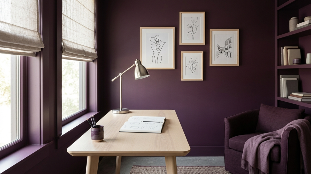
What it is: Wrapping an art studio, sewing room, or writing nook in a rich, sophisticated shade of aubergine, plum, or deep sienna.
Why it works: Deep purple-brown tones stimulate the creative centers of the brain while providing a stable, moody environment that changes beautifully as daylight shifts.
Best materials: Matte light-colored birch wood desks, linen roman shades, and brushed nickel hardware to cool down the warmth.
Best colors: Farrow & Ball – Brinjal, Benjamin Moore – Shadow (2117-30), Sherwin-Williams – Blackberry (SW 7577).
Common mistakes: Over-decorating with multi-colored artwork that fights the walls. Let the wall color be the art; choose monochrome or minimalist line art in simple frames.
Budget-friendly alternative: Instead of custom window treatments, buy basic canvas drop cloths from a hardware store, hem them to size, and use them as curtains to introduce a rustic textile contrast against the plum walls.
8. The Charcoal Black Kitchen
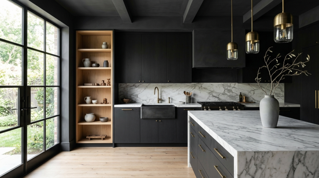
What it is: Color drenching a kitchen in charcoal black or soft black, including cabinetry, walls, trim, and ceiling.
Why it works: Creates a luxurious, high-end architectural look while allowing natural materials like oak, marble, and brass to stand out.
Best materials: White oak, honed marble, brushed brass, blackened steel.
Best colors: Farrow & Ball – Railings, Sherwin-Williams – Iron Ore, Benjamin Moore – Wrought Iron.
Common mistakes: Using glossy black on every surface, which creates excessive reflections and fingerprints.
Budget-friendly alternative: Paint only upper walls, ceiling, and existing cabinets in the same charcoal tone while keeping countertops unchanged.
Furniture Recommendations
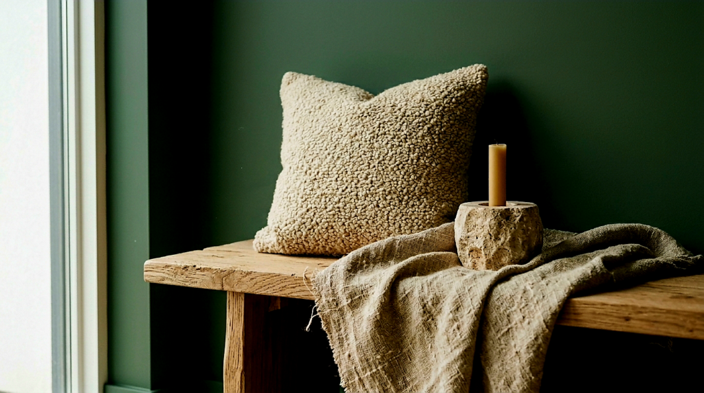
When your architecture is wrapped in a single, immersive hue, your furniture choices can no longer be casual additions. Every piece of furniture becomes a sculpted silhouette sitting inside a monochromatic envelope.
What Furniture Works Best
- High-Texture Contrast: Because the walls lack color contrast, your furniture must provide tactile contrast. Opt for materials with pronounced, raised grain or weaves. Think raw, open-grain white oak, heavily textured bouclé, coarse slubby linens, corduroy, and tumbled stone tables.
- Tonal Harmony (The Monochromatic Layer): For a deeply curated look, select large furniture pieces that are a few shades lighter or darker than the wall color. For instance, if your room is drenched in olive green, a sage-tinted velvet sofa or a dark forest-green leather armchair will look integrated, intentional, and high-design.
- Sculptural Silhouettes: Because the background is seamless, the outline of your furniture is highly visible. Choose chairs with organic curves, tables with architectural pedestal bases, and lighting with clean, graphic lines.
What Should Be Avoided
- Highly Polished, Generic Veneers: Cheap, mid-tone orange laminate or plastic-looking fake wood finishes clash aggressively with complex, saturated paint colors. They look instantly out of place.
- Teeny-Tiny, Leggy Furniture: Avoid a collection of small, spindly-legged chairs and tables. They create messy, chaotic shadows against a drenched wall, breaking down the peaceful, expansive illusion of the monochromatic paint. Opt for grounded, blocky, or plinth-base furniture instead.
- Pure Stark White Plastics: A glossy white plastic coffee table or desk will look like a glaring error in a drenched room. If you want a light contrast, look to natural creams, ivory wools, bleached woods, or honed travertine stone.
Lighting Strategy
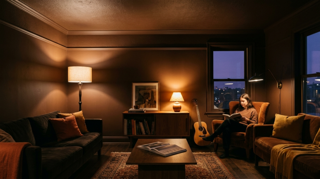
Lighting is the ultimate make-or-break element for a color-drenched space. If you light a drenched room like a standard white-walled room, you will end up with a flat, lifeless, or uncomfortably dark box.
Natural Light Analysis
• North-Facing Rooms: These rooms receive cool, blue-tinted natural light throughout the day. Do not fight this with cool blues or greys. Lean into the darkness by color drenching in warm chocolate browns, terracottas, or deep plum-reds. The warm paint undertones will counteract the icy northern light.
• South-Facing Rooms: These spaces receive intense, golden light. They can easily handle highly saturated colors like dark olives, deep navies, and charcoals without feeling gloomy. The sunlight will bring out the hidden complexities of these dark tones.
Artificial Lighting Adjustments
Saturated surfaces absorb a massive amount of lumens. You will need to increase the output of your bulbs slightly, but more importantly, you must lower the color temperature. Never use cool white bulbs (4000K–5000K) in a color-drenched room; they will turn your luxurious burgundy or olive oasis into a clinical, institutional nightmare. Stick strictly to warm, incandescent-mimicking bulbs between 2700K and 3000K.
Layered Lighting Tips
• The Death of Overhead Lighting: Turn off the central flush-mount ceiling light. Direct downward light on a drenched ceiling creates a harsh hotspot while leaving the corners in deep shadow.
• Embrace Up-Lighting and Wall Washing: Use floor lamps that cast light upward onto the flat-finished ceiling, allowing the light to gently bounce back down across the room. Use adjustable track heads or recessed fixtures to ‘wash’ light smoothly down the walls, highlighting the subtle sheen differences between the matte walls and satin baseboards.
• Low-Level Ambience: Place lamps at varying heights—table lamps on sideboards, floor lamps next to reading chairs, and plug-in sconces at eye level. This creates pockets of warm light and soft shadows, making the room feel endlessly deep and cozy at night.
Common Design Mistakes
Mistake 1: Leaving the Radiators, Vents, and Switch Plates White.
Why it fails: A single white plastic light switch or a white radiator on a deep burgundy wall draws the eye immediately, destroying the infinite, seamless illusion of color drenching.
How to avoid it: Purchase paintable switch plates or spray-paint your existing plastic covers using a primer and a matte spray paint matched exactly to your wall color. Use specialized heat-resistant radiator paint to blend your heating units seamlessly into the background.
Mistake 2: Using the Exact Same Paint Sheen on All Surfaces.
Why it fails: If you paint the ceiling, walls, and trim all in a flat matte finish, the room will lose its structural definition and look like a muddy cardboard box. If you paint everything in satin, the ceiling will reflect every floor lamp, causing a distracting, cheap glare.
How to avoid it: Always order your single color in at least three distinct finishes: Dead Flat for the ceiling, Matte/Chalky for the walls, and Satin/Gloss for the trim and doors.
Mistake 3: Fearing the Ceiling (The White Ceiling Cop-Out).
Why it fails: Homeowners often get nervous at the last minute and decide to leave the ceiling bright white while painting the walls and trim dark green. This cuts the room in half visually, lowers the perceived height of the ceiling, and emphasizes the lack of cohesion.
How to avoid it: Commit fully. If you are afraid of a dark ceiling, choose a lighter, mid-tone color for the entire project rather than abandoning the ceiling. The magic of color drenching only happens when the ceiling matches the walls.
Mistake 4: Forgetting the Inside of the Doors and Window Casings.
Why it fails: When the door is closed, an unpainted door interior creates a giant, jarring rectangle of white that completely breaks the mood of your drenched sanctuary.
How to avoid it: Paint both sides of the entrance door, the door frame, the window sills, and the interior window sashes. When you look out the window, the drenched frame will frame your outdoor view like a professional landscape painting.
Mistake 5: Lack of Textural Variety in the Decor.
Why it fails: If your walls are smooth matte paint, your sofa is smooth cotton, your rug is flat-woven nylon, and your tables are smooth painted MDF, the room will feel visually deadening and claustrophobic.
How to avoid it: Introduce a rough-hewn stone bowl, a deeply grained rustic oak stool, a thick wool-pile rug, and rumpled linen curtains. Texture replaces color contrast in a monochromatic room.
Frequently Asked Questions (FAQ)
Q: Will color drenching make my small room look smaller?
A: No. This is the most common interior design myth. What actually makes a small room look smaller are high-contrast transition lines (such as dark walls paired with a bright white ceiling and white baseboards), which visually box you in. Color drenching removes these boundary lines, causing the corners and ceiling transitions to recede from view, which frequently makes a compact room feel far more expansive and open.
Q: Do I have to use dark colors for color drenching?
A: Not at all. While dark colors like navy, burgundy, and olive create a dramatic, moody effect, you can color drench using soft, light tones. Drenching a room in a warm buttery yellow, a soft sage green, or a pale, earthy plaster-pink works beautifully. The core principle remains the same: wrap the walls, trim, and ceiling in that single pale color to eliminate harsh white contrast lines.
Q: How do I handle artwork on a color-drenched wall?
A: Avoid small, busy gallery walls with thin black or white frames, which create visual clutter against a saturated background. Instead, opt for fewer, larger art pieces. Frame your art in rich wood tones that complement the paint, or use metallic frames like antique gold or raw brass to create a sophisticated gleam. Alternatively, mount canvas art without a frame to let the art float organically on the drenched wall.
Q: What should I do with my flooring in a color-drenched room?
A: You do not need to paint your floors. Natural wood flooring, brick, stone, or neutral carpets act as an organic foundation for color drenching. If your wood floors have an aggressive orange or red undertone that clashes with your chosen paint, use a large, neutral-colored area rug (such as a cream wool or natural jute rug) to cover most of the floor, creating a buffer zone between the flooring and your drenched walls.
Q: Is color drenching a passing trend that will look dated soon?
A: While the term “color drenching” is modern marketing, the actual design technique is rooted in historic architecture. For centuries, stately homes in England, France, and Italy painted entire libraries, drawing rooms, and salons in single, rich colors—including the ornate plaster moldings. It is a timeless, architectural approach to paint that outlives fast-fashion design cycles because it focuses on space optimization and emotional comfort.
Conclusion
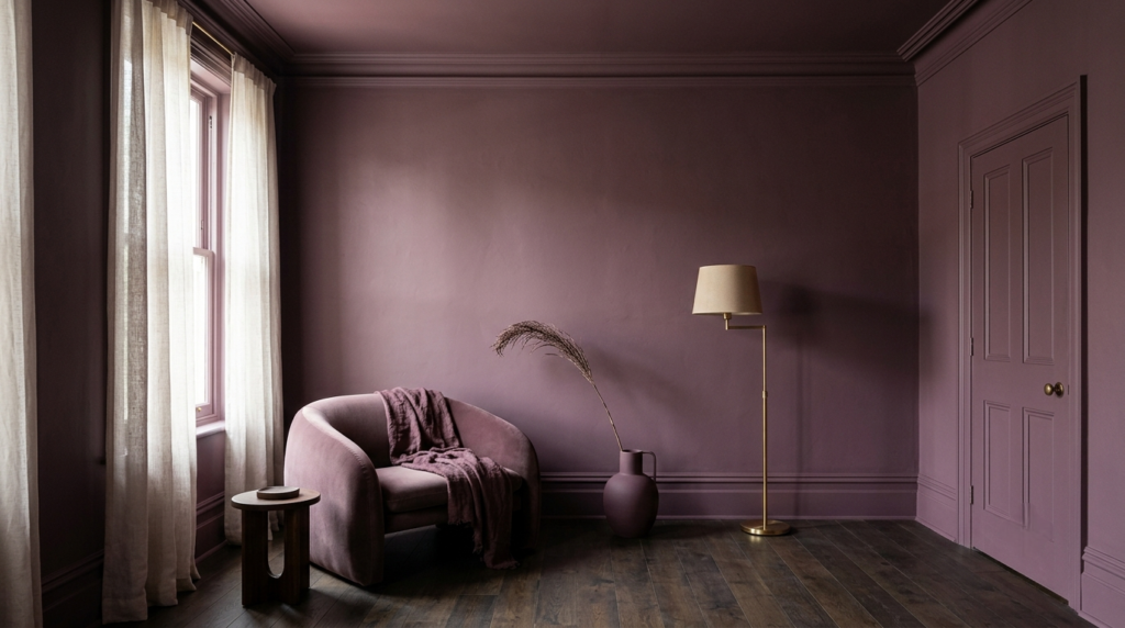
Color drenching is far more than a simple decorating trend; it is a profound architectural tool that shifts our relationship with our homes. By removing the traditional, predictable white boundaries of a room, this technique allows us to experience color as an immersive, emotionally resonant environment. It offers an elegant solution for awkward, low-ceilinged rooms, breathes life into dark, windowless spaces, and transforms ordinary rooms into luxurious, intentional sanctuaries.
Key Takeaways
• Commit to the Envelope: To achieve the true spatial benefits of color drenching, you must paint the ceiling alongside the walls and trim. Leaving the ceiling white fractures the room’s flow.
• Vary the Sheens: Keep your color consistent, but utilize Dead Flat on ceilings, Matte on walls, and Satin or Gloss on trim to maintain architectural depth and texture.
• Texture is Your Contrast: When color contrast is removed, rely heavily on tactile materials—such as raw woods, bouclé fabrics, natural stone, and unlacquered metals—to bring the room to life.
• Warm the Light: Transition your lighting strategy away from harsh overhead fixtures toward layered, low-level lamps fitted with warm (2700K–3000K) bulbs to maximize the cozy, cocooning atmosphere.